From Turnstile to Seat: The Logic of a Stadium Concourse
A stadium concourse works best as a sequence of clear decisions. See how entrances, signs, stairs and seating routes can make arrival less confusing.
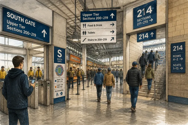
Where should a stadium route tell you what to do next? A well-arranged stadium concourse answers in stages: enter, orient yourself, choose a route, then reach the seating block without having to solve the whole building at once. The design is less a single corridor than a sequence of spaces that hands visitors from one decision to the next.
Start at the approach
The journey begins before the turnstile. A visitor approaching from a plaza, transit stop or parking area needs to recognize the correct entrance and understand whether it serves a particular stand, level or ticket group. If every gate looks alike, the first meaningful direction may arrive too late, after people have already joined the wrong queue.
Good entry planning connects signs outside the building to signs inside it. Names, colors and symbols should remain consistent as a visitor moves from the perimeter to the gate and on to the seating section. A sign that changes from “East Stand” outside to “Upper Tier” inside may be technically accurate but leaves people wondering whether they are still going the right way.
The threshold itself has a practical job. It should make the shift from open approach to controlled entry legible, while leaving enough room for people to pause and check a ticket without blocking the flow behind them. Where several gates are close together, clear distinctions matter more than decorative variation: a readable stand name or sector marker is easier to act on than a subtle change in facade treatment.
Give the concourse a job
Once inside, visitors need a place to orient themselves. A concourse can provide that pause if it is wide and open enough to let people look for signs, meet companions or decide which direction to take. But the same space may also carry queues for food, toilets and other services. The layout has to account for those activities rather than treating the concourse as an empty hallway.
One useful principle is to keep the main through-route visually and physically distinct from places where people stop. Concession counters and queue rails can sit to the side, while the route toward seating remains apparent. Seating entrances, stairways and ramps should be easy to pick out from the concourse, not hidden behind a cluster of signs or the back of a queue.
That distinction helps visitors who are moving at different speeds. Someone heading straight to a seat should not have to weave through people choosing food. Someone who needs time to read a directory should have room to step aside without becoming an obstacle. A concourse works as a shared public room when it supports both movement and brief pauses.
Make each choice visible
Large venues often divide a stand into named or numbered sections, then into rows and seats. The route should reveal those divisions in a sensible order. A visitor needs to identify the stand or tier first, then the section, then the row. Signs that present every label at once can turn a simple search into a wall of competing information.
Visibility matters as much as wording. From a decision point, a person should be able to see the next useful cue: a stair, a ramp, a tunnel opening or a section marker. A sign placed around a corner may be perfectly legible when standing beside it but useless to someone deciding which corridor to enter. Repeating a small amount of directional information at junctions can prevent uncertainty from piling up.
Say a visitor enters a fictional venue through a south gate with a ticket for Section 214. At the first concourse junction, a sign identifies the upper tier and points toward sections 200–219. Near the stair, another marker confirms Section 214; at the seating entrance, row letters direct the visitor along the correct aisle. Each cue answers one question, so the visitor does not need to memorize a complicated route from the gate.
Not every surface needs a sign. Too many arrows, sponsor panels and temporary notices can compete for attention. It is not worth adding another instruction where the next route is already obvious; effort is better spent making the important signs consistent, visible and positioned before the choice they explain.
Keep routes connected
Stairs, ramps, lifts and vomitories—the openings that lead from a concourse into seating—are the links between levels and the final threshold to a block. Their placement should make the route feel continuous. If a visitor follows signs to an upper tier only to encounter an unexpected dead end or a confusing change of level, the building has broken the promise made by its directions.
Where possible, routes should connect directly to recognizable landmarks. A visitor can understand “Section 214” more readily when the label appears at the entrance to that section than when it is visible only from the far end of a long passage. Repeated section labels can also reassure people that they have not drifted into another part of the stand.
Accessible routes should be part of the same wayfinding logic, not an afterthought that sends visitors on an unexplained detour. Signs need to identify lifts and step-free paths at the points where a route divides. The path should connect to the same destinations, even if it approaches from a different direction. For the right route, follow the venue’s accessibility information and staff guidance, since available facilities and operating arrangements vary.
Routes also have to work in reverse. After an event, visitors leave seats, enter the concourse and head toward exits, transit or meeting points. A layout that is easy to understand only while arriving may become confusing when the crowd is moving in the opposite direction. Exit signs and recognizable landmarks should remain clear from the seating area outward.
Plan the arrival sequence
An arrival sequence works when each sign answers the question people have at that point, rather than sending them on to solve a later decision too early. The entrance should confirm where they are; the concourse should show the next route; and the seating entrance should confirm the section and aisle.
Where should a stadium entrance lead?
It should lead into a space where visitors can orient themselves before choosing a stand or level. If the entrance opens directly into a crowded service queue, the next route may be difficult to spot.
What makes concourse signs useful?
Useful signs name the destination in terms visitors can match to their tickets, then point toward the next decision. Place them before a junction or level change, not after someone has passed the point where the information was needed.
How should seating sections be marked?
Use a consistent sequence: stand or tier, section, then row or aisle. Repeat section identifiers at the seating entrance so visitors can confirm the destination as they arrive.
Why consider the route out?
Visitors need to retrace familiar spaces or follow exit directions after the event, often amid a moving crowd. Clear connections from seating blocks to concourse exits help the building remain understandable in both directions.
Review the route in use
A route that looks clear on a plan can feel different once people occupy it. Venue teams can review the sequence at different points in the event day: before gates open, as visitors enter, and during departure. The purpose is not to collect a score but to notice where the route stops making sense. Do people hesitate at a particular junction? Are queues obscuring a section sign? Does a gate name match the language on tickets and maps?
Record observations by location and by moment. A sign may be easy to read when the concourse is empty but hidden behind a crowd during entry. A queue may be manageable early and spill across a stair approach later. Separating these conditions helps staff decide whether the issue calls for a different sign position, a clearer route boundary, or a change in how a service queue is arranged.
Temporary arrangements deserve the same attention. A closed entrance, event-day barrier or relocated kiosk can interrupt a familiar route. If a visitor is redirected, the new direction should appear before the blocked path, with a clear alternative that reconnects to the original sequence. An arrow pointing at a barrier is not a route.
Design for the handoff
The strongest stadium routes make each space prepare visitors for the next one. The approach identifies the gate; the entrance confirms arrival; the concourse offers orientation; signs direct visitors to a tier and section; the seating entrance completes the handoff to the row. When those cues use the same names and appear at the right moments, people can make small decisions instead of guessing at a long route.
That is the practical logic of a stadium concourse: not simply moving people quickly, but giving them enough information and room to move with purpose. A useful way to assess any route is to pause at each junction and ask what a first-time visitor can see, what they still need to know, and whether the next action is apparent. If those answers line up from turnstile to seat, the building is doing more than carrying a crowd—it is helping each person understand where to go next.